Colour Theory
Understanding the Psychology, Meaning, and Power of Colour in Design
Have you ever noticed how some brands instantly feel trustworthy, energetic, luxurious, or calming?
More often than not, colour is doing much of the heavy lifting. Thinking about this stuff takes me back to my time in art class at college and at NatColl.
Whether you’re designing a website, creating marketing materials, developing a new brand identity, or refreshing an existing one, understanding colour theory can help you make more effective design decisions and create stronger connections with your audience.
Colour isn’t simply about aesthetics. It influences perception, shapes emotions, guides behaviour, and often forms a customer’s first impression of your business. Before someone reads your message or explores your products and services, they have already formed an opinion based on what they see.
In this guide, we’ll explore the history of colour theory, how the colour wheel works, the psychology behind colour choices, what different colours represent, and best practices for using colour in branding and design.
What Is Colour Theory?
Colour theory is the study of how colours interact with one another and how people respond to them visually and emotionally.
Designers use colour theory as a framework for creating colour combinations that are balanced, harmonious, and purposeful. It helps determine which colours work well together, how contrast can improve readability, and how colour can influence the way a message is perceived.
Think of colour theory as the science behind effective visual communication.
When applied correctly, colour can strengthen brand recognition, improve user experience, direct attention, create emotional connections, and influence purchasing decisions. When applied poorly, it can create confusion, reduce trust, and weaken a brand’s impact.
A Brief History of Colour Theory
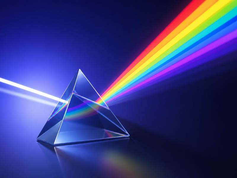
The foundations of modern colour theory date back to the 17th century when Sir Isaac Newton conducted a series of experiments using prisms and light.
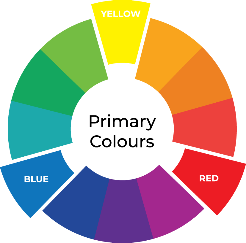
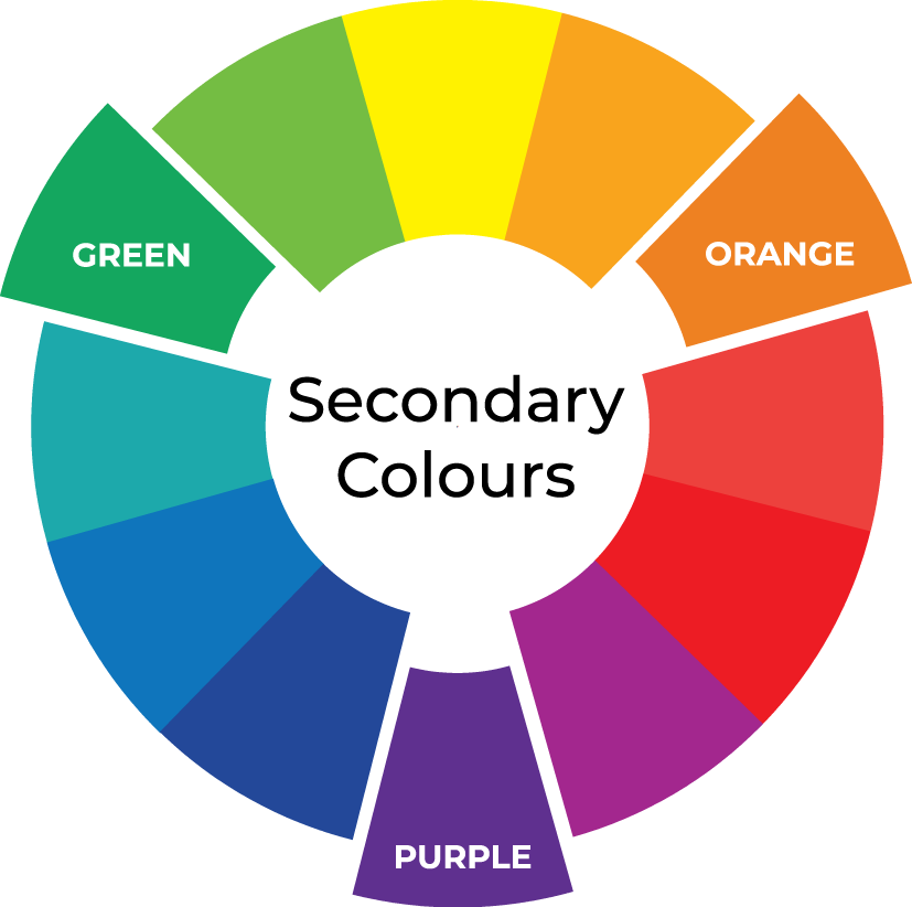
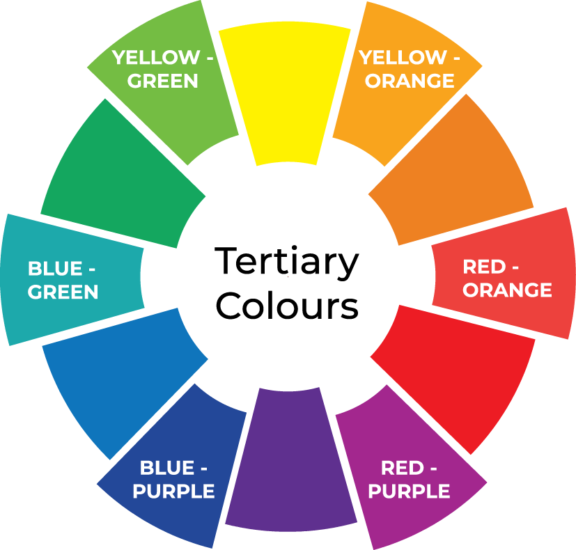
Newton discovered that white light could be separated into a spectrum of colours, demonstrating that colour was not simply created by objects themselves but was an inherent property of light. His discoveries led to the development of the first colour wheel, a visual tool that is still used by designers today.
In the centuries that followed, artists, scientists, and philosophers expanded upon Newton’s work. They began exploring not only how colours mix together, but also how they influence emotions, perception, and human behaviour.
These studies eventually evolved into the colour systems and design principles that underpin modern branding, graphic design, marketing, and visual communication.
The Colour Wheel Explained
The colour wheel is one of the most important tools in colour theory.
It visually organises colours according to their relationships and helps designers create colour schemes that feel balanced and effective.
Primary Colours
Primary colours are the building blocks of all other colours.
They cannot be created by mixing other colours together.
The three primary colours are:
Red
Yellow
Blue
Every colour on the wheel originates from these three foundational colours.
Secondary Colours
Secondary colours are created by combining two primary colours.
Red + Yellow = Orange
Yellow + Blue = Green
Blue + Red = Purple
These colours sit between the primary colours on the wheel.
Tertiary Colours
Tertiary colours are formed by mixing a primary colour with a neighbouring secondary colour.
Examples include:
Yellow-Green
Blue-Green
Blue-Purple
Red-Purple
Red-Orange
Yellow-Orange
These colours provide greater flexibility and allow designers to create more sophisticated and nuanced colour palettes.
Why Colour Matters in Branding
Colour is one of the most recognisable aspects of a brand.
It helps businesses communicate personality, values, and positioning long before customers engage with the content itself.
The colours used throughout a website, logo, packaging, signage, or marketing campaign can influence how a brand is perceived. They can help create feelings of trust, excitement, confidence, luxury, innovation, or comfort.
This is why successful brands rarely choose colours at random. Every colour selection should support the overall brand strategy and help communicate a consistent message across all customer touchpoints.
Colour Psychology:
What Different Colours Mean
While colour meanings can vary across cultures and personal experiences, certain colours tend to evoke consistent emotional responses.
Understanding these psychological associations can help businesses choose colours that align with their brand personality, target audience, and marketing objectives.
Red
Red is bold, powerful, and impossible to ignore.
It is commonly associated with:
Energy
Passion
Excitement
Strength
Urgency
Because it naturally attracts attention, red is often used in promotions, food branding, sports marketing, and call-to-action buttons.
Blue
Blue is one of the most widely used colours in branding.
It often represents:
Trust
Reliability
Professionalism
Security
Calmness
Confidence
Many corporate, technology, healthcare, and financial organisations use blue to create a sense of confidence and credibility.
Green
Green has strong associations with the natural world.
It is commonly linked with:
Growth
Health
Wellness
Sustainability
Freshness
Prosperity
Green is particularly popular among wellness brands, healthcare providers, environmental organisations, and businesses focused on sustainability.
Yellow
Yellow is bright, energetic, and uplifting.
It often conveys:
Happiness
Warmth
Optimism
Creativity
Positivity
When used strategically, yellow can create a welcoming and energetic atmosphere while drawing attention to important information.
Orange
Orange combines the energy of red with the warmth of yellow.
It is often associated with:
Creativity
Enthusiasm
Confidence
Adventure
Innovation
Brands looking to appear approachable, energetic, and modern often incorporate orange into their visual identity.
Purple
Historically associated with royalty and wealth.
Purple often communicates:
Luxury
Creativity
Imagination
Sophistication
Wisdom
Ambition
Purple is frequently used by premium brands, beauty companies, and organisations looking to project a sense of exclusivity.
Pink
Compassion, Nurturing and Optimism.
Pink is commonly associated with:
Compassion
Kindness
Nurturing
Optimism
Romance
Creativity
Playfulness
Depending on the shade, pink can communicate very different messages. Soft blush and pastel pinks often feel calming, caring, and approachable, while vibrant pinks can feel energetic, bold, confident, and playful.
Grey
Grey provides a neutral foundation that complements other colours.
It is often associated with:
Stability
Professionalism
Maturity
Balance
Practicality
Grey is widely used in contemporary branding because it allows stronger colours to stand out while maintaining a sophisticated appearance.
Black
Black is timeless, versatile, and powerful.
It often represents:
Elegance
Luxury
Sophistication
Authority
Exclusivity
Many premium and luxury brands use black to create a refined and professional appearance.
White
White creates a sense of openness and balance.
It is commonly associated with:
Simplicity
Clarity
Cleanliness
Purity
Transparency
Minimalism
In modern design, white space is often just as important as colour itself.
